Peter’s Kettle Corn Brand Revamp
About This Project
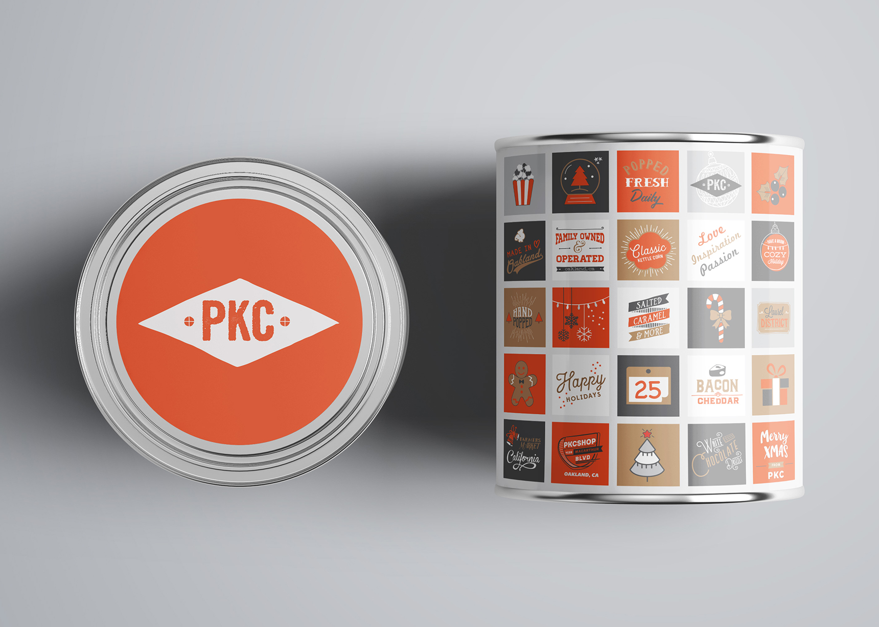
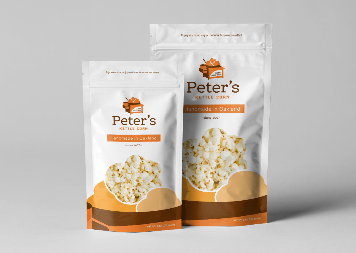
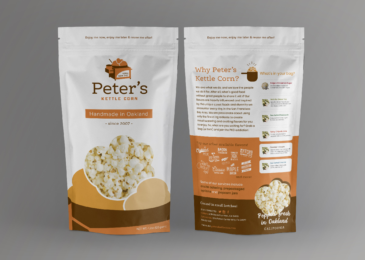
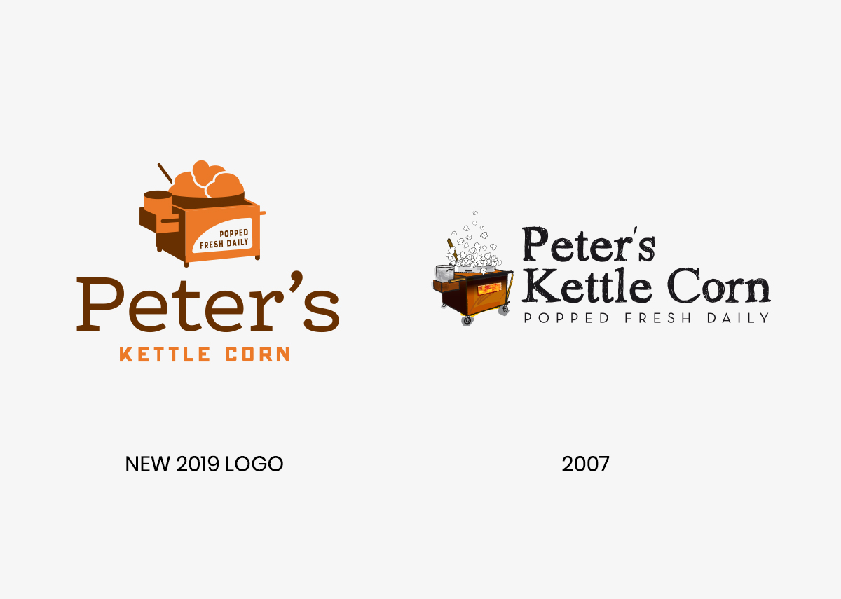
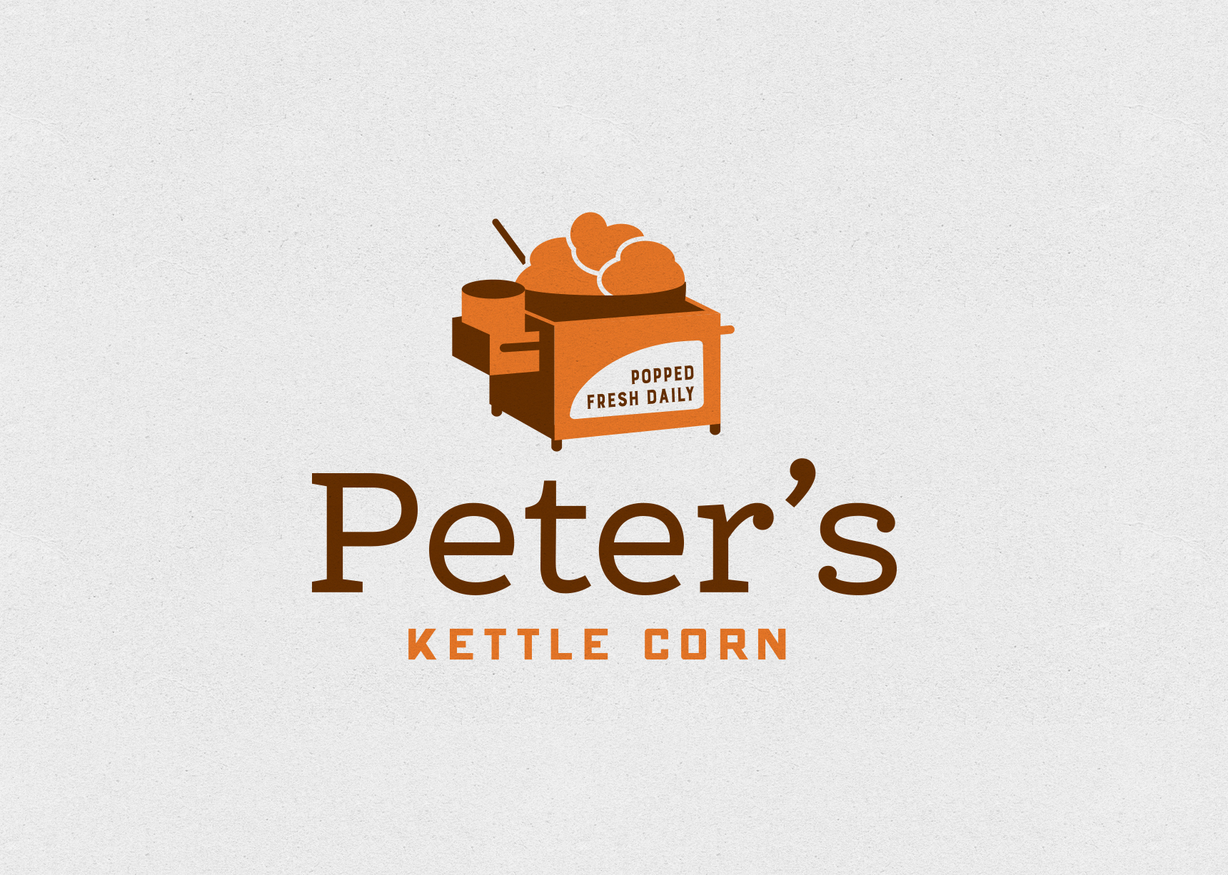
Our rebranding of Peter’s Kettle Corn logo modernizes the classic design while still maintaining its recognizability for loyal customers. The new logo incorporates the use of burnt orange and brown, colors that evoke the warm and savory taste of kettle corn. The fresh, modern design is eye-catching and sure to stand out in the crowded snack market. Overall, the rebranding successfully updates the company’s image while still paying homage to its roots.
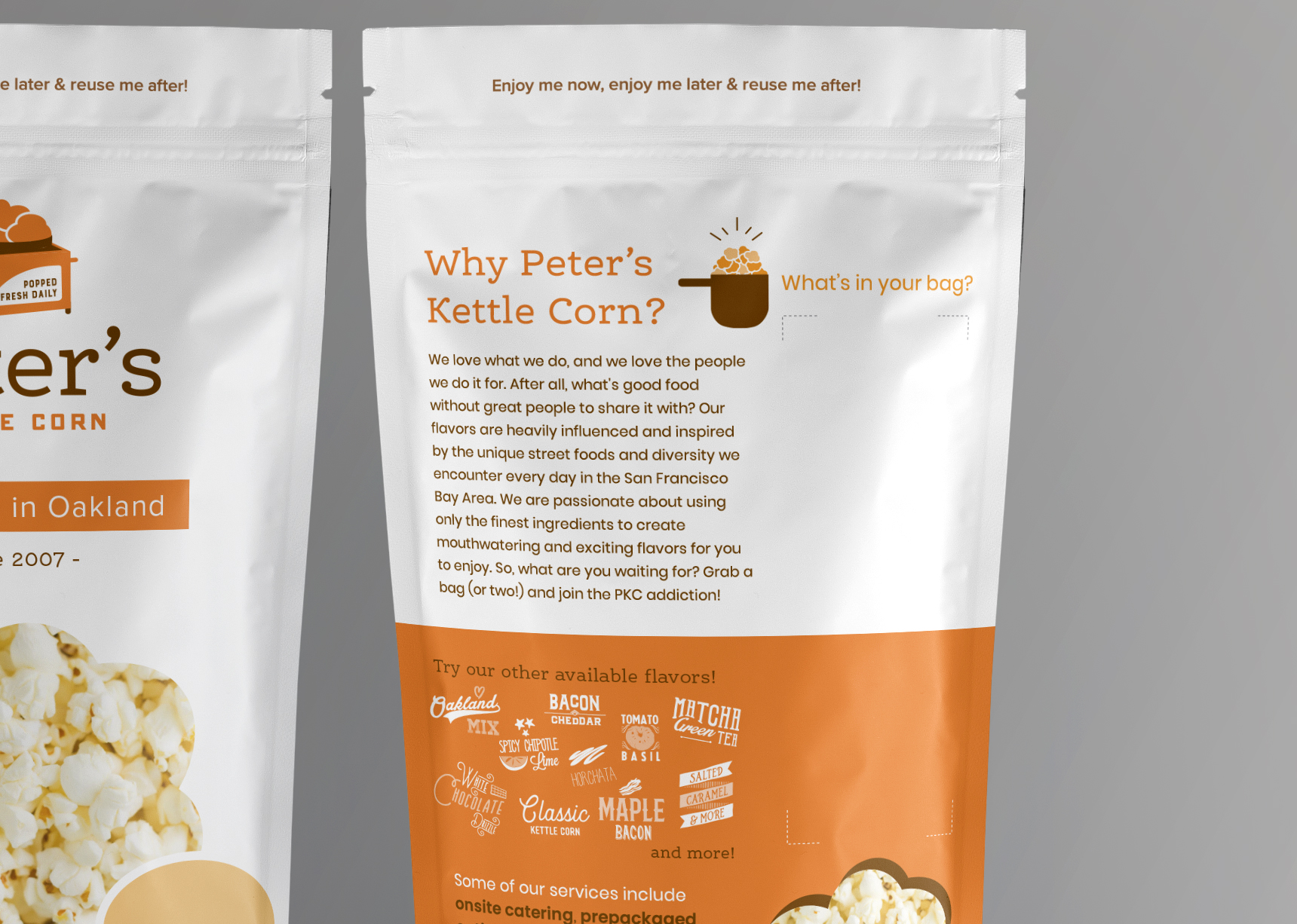
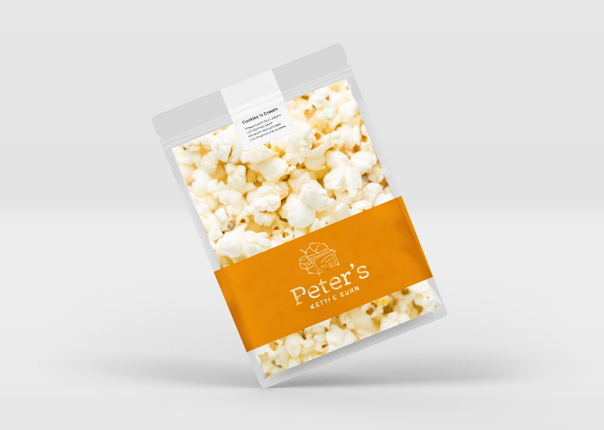
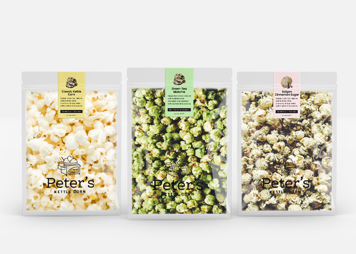
Due to budget constraints, we didn’t have the option to design variations of the bag with different flavors, but instead had to come up with a solution to accommodate the 30 flavors they had. In addition to that, PKC allowed their customers to have a mix of up to 6 flavors per bag. Pretty cool for their customers but definitely a design challenge for me! Fortunately, we were able to come up with a solution. I allotted space for up to (6) 3″x1″ sticker labels on the back side of the bag for easy labeling.